The digital startup ecosystem has never been more competitive. According to recent data from the U.S. Bureau of Labor Statistics, around 20% of new businesses fail within the first two years, and only 25% make it to 15 years or more. In the tech space, where innovation and agility are crucial, the stakes are even higher. Startups face intense pressure to launch quickly and capture market share, yet a staggering 70% of app users abandon an app after just one use, according to Localytics.
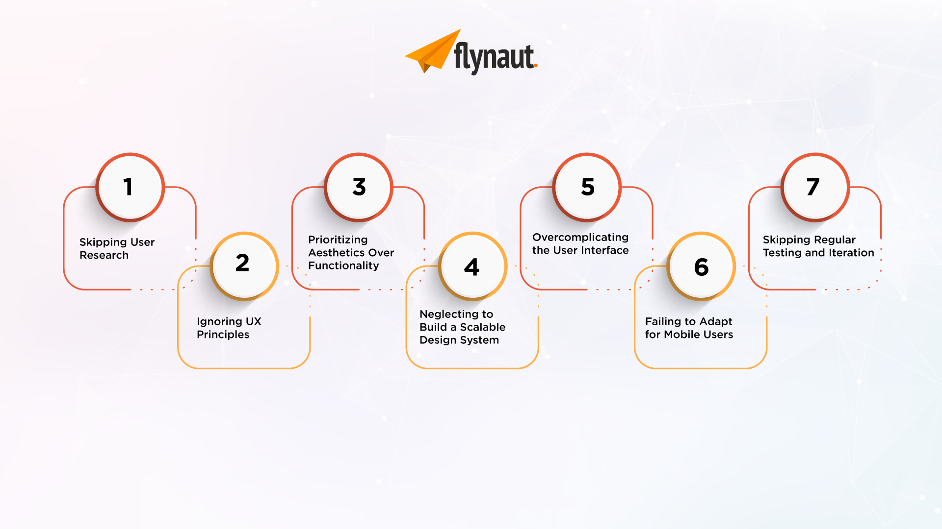
Often, these failures stem not from a lack of ideas or resources but from critical design mistakes in product development. Design isn’t just about aesthetics; it’s about creating seamless, intuitive experiences that meet users’ needs and solve their problems efficiently. When startups overlook essential design principles, they risk delivering a product that doesn’t resonate, leading to poor user retention and ultimately, business failure. Here’s a deep dive into seven key design mistakes that startups can’t afford to make if they want to build a product that truly stands out.
Mistake #1: Skipping User Research
User-centered design is key to product success, and yet many startups jump straight into development, relying on assumptions rather than validated user insights. Without this foundational step, products may fail to resonate with users, leading to poor engagement or abandonment. For example, the social media app “Peach” was highly anticipated but soon floundered. It launched without thorough testing of how users would engage with the app’s unique features, which ultimately failed to align with their social media habits.
Solution: Invest in thorough user research early on. Surveys, interviews, and usability testing with your target audience can provide invaluable insights. Start with platforms like SurveyMonkey or UserTesting to gather feedback.
Mistake #2: Ignoring UX Principles
User Experience (UX) is more than just a trendy buzzword; it’s a critical component of product design. Ignoring established UX principles—like intuitive navigation, accessibility, and responsive design—can alienate users and harm your brand’s reputation. Consider Snapchat’s major 2018 redesign, which angered many users by placing Stories and direct messaging in separate tabs. The backlash was so intense that a petition on Change.org garnered over a million signatures, pushing Snapchat to revert to its original UX.
Solution: Ensure that all team members understand and implement UX best practices, or consult with a UX expert who can help refine your design. For instance, using platforms like Figma or Adobe XD can help teams collaborate on UX design, making it easier to test user flows and design intuitive interfaces.
Mistake #3: Prioritizing Aesthetics Over Functionality
A visually stunning app that doesn’t deliver on functionality is a quick recipe for failure. Design should always serve the product’s core purpose. A notable example is the app “Path,” which emphasized beautiful visuals and animations but struggled with a cluttered UI and limited functionality. Users found it challenging to navigate and accomplish basic tasks, ultimately leading to its decline.
Solution: Collaborate closely with your development team to balance design with performance. Test iteratively to find a balance that pleases both the eye and the user experience. Platforms like InVision can assist in creating interactive prototypes, allowing startups to gather feedback before full-scale development.
Mistake #4: Neglecting to Build a Scalable Design System
Design inconsistency can confuse users and harm brand identity. As products grow, lacking a scalable design system can lead to a fragmented experience. Airbnb provides an excellent example of doing this right. They invested heavily in creating their “Design Language System,” which unifies design and experience across all platforms, leading to a more cohesive brand identity.
Solution: Start with a foundational design system that defines elements like colors, typography, buttons, and layouts. This will ensure consistency as your product evolves. Tools like Storybook are helpful for building, testing, and sharing UI components, ensuring that each part of your design system remains scalable.
Mistake #5: Overcomplicating the User Interface
A cluttered UI can overwhelm users, causing frustration and abandonment. The best designs are often the simplest, allowing users to accomplish tasks with minimal effort. LinkedIn’s early app was criticized for a cluttered interface that bombarded users with too much information. Since then, LinkedIn has adopted a more minimalistic design, prioritizing essential functions and decluttering its interface.
Solution: Adopt a minimalist approach, focusing on the essentials. Each element should have a purpose, enhancing functionality rather than adding noise. Look to platforms like Google’s Material Design for inspiration on creating clean, effective interfaces.
Mistake #6: Failing to Adapt for Mobile Users
With mobile device usage continuing to rise, neglecting mobile-first design can seriously hinder product reach and engagement. Despite a large user base, Google’s social network, Google+, initially struggled on mobile because its desktop-first design didn’t translate well to mobile, impacting usability and engagement.
Solution: Employ responsive design principles and prioritize mobile during testing phases to ensure an optimal experience across all devices. Platforms like Zeplin allow designers to create specs for responsive layouts, making collaboration with developers on mobile optimization easier.
Mistake #7: Skipping Regular Testing and Iteration
Testing shouldn’t end at launch. Products must be continuously refined based on user feedback to stay relevant and effective. A classic example is Facebook, which has repeatedly tested and refined its interface and algorithms over the years based on extensive A/B testing and user feedback. Regular testing allows for small adjustments that better meet user needs and preferences.
Solution: Schedule regular testing and updates as part of your product roadmap. Post-launch analytics and user feedback loops can identify issues and uncover new opportunities for improvement. Tools like Hotjar and Mixpanel provide valuable insights into user behavior, which can guide iterative improvements.
Conclusion
Avoiding these common design pitfalls can set your product on a path toward sustained growth and user satisfaction. Each step of the design process should be deliberate, with the end user in mind. By prioritizing user research, adhering to UX principles, maintaining simplicity, and conducting regular testing, startups can craft products that captivate and retain users.
Are you ready to bring your digital product idea to life? At Flynaut, we specialize in creating user-centered designs that help startups thrive. Contact us today to see how we can turn your vision into a successful product!


